KM Plastic Surgery
KM plastic Surgery needed a modern website that could do more than look polished—it had to help prospective patients confidently explore procedures, build trust, and take action. The existing site struggled with cluttered navigation, unclear pathways, and missed opportunities to convert interest into appointments.
Services
UX Design, Information Architecture, Wireframing, UX Strategy
Client
KM Plastic Surgery


The Problem
Prospective patients were coming to the site ready to research and compare procedures, but the experience made that journey harder than it needed to be.
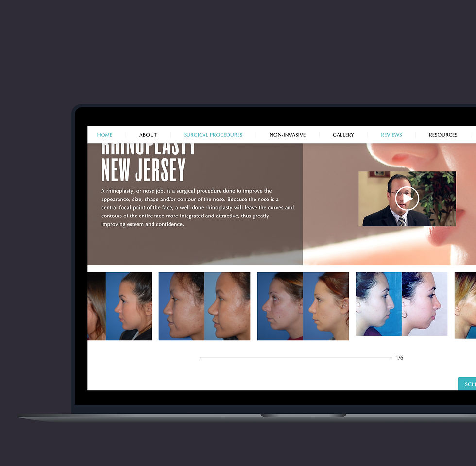
Content was organized around internal service groupings instead of patient intent, resulting in cluttered navigation and inconsistent access to critical decision-making content like procedure details, before-and-after galleries, and testimonials.
These issues were noticeable on mobile, where most users were browsing and making early decisions about whether to book a consultation or move on. Most conversions happen via phone call and not through the website.
Why it mattered: when patients can't quickly find the information they need to build confidence, they're far less likely to take the next step—no matter how strong the services are.
UX Strategy & Research
To ground design decisions in real behavior, I worked from multiple inputs:
-
Analyzed site analytics to understand traffic patterns, device usage, and conversion drop-offs
-
Conducted patient surveys and reviewed feedback to identify what users were looking for and where they felt friction
-
Conducted a competitive UX audit to identify best practices around procedure discovery, galleries, and trust-building elements
-
Defined a clear task flow that aligned business goals with patient intent from exploration to consultation
These insights shaped the site's structure, content hierarchy, and interaction patterns.
.jpg)


The Solution
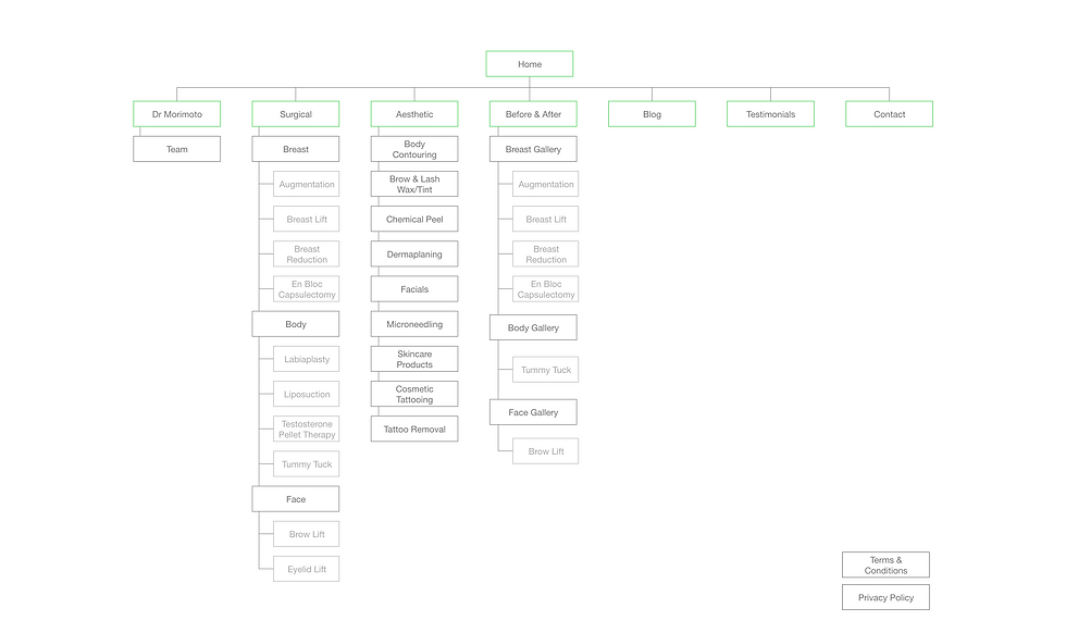
The redesigned experience focused on clarity, confidence, and momentum. Content was reorganized into intuitive categories, navigation was simplified to reduce cognitive load, and key conversion moments—such as scheduling and contact—were made easier to find and act on.
Key UX improvements included:
-
A restructured information architecture aligned to how patients explore procedures
-
Clear, scannable procedure and service pathways
-
Improved before-and-after gallery discovery to support decision-making
-
Streamlined conversion flows for scheduling and contact
-
Mobile-first considerations to support how most users accessed the site


Learnings & Outcomes
Following launch, the site demonstrated strong engagement and trust signals:
-
Significant improvement in appointment requests generated through online scheduling
-
Survey feedback showing most users found the site helpful and easy to navigate
Together, these results reinforced that simplifying structure and aligning UX with patient intent directly improved engagement and conversions.
All Projects


